We often get requests from folks to “build me…” and a document with a list of features and a request that we use “Vue with a restful JSON API on a Laravel platform….”. From a short-term revenue perspective this is great; if they have budget we can build almost anything and the software will be wonderful.
However, more often than not that initial “specification” is not what the client really wants. We’ve all been involved in projects where starting with “how” ends with an unhappy client. To ensure our clients are satisfied, we need to take a moment to understand “why” their project is important, “who” it will be important for and “what” they really want. Then we can build (or sometimes just configure) a solution that will drive their business.
Here is a recent example of how this should work:
Client Situation
We have a client who custom-builds high-end luxury products. They had a site with a nice picture and a “coming soon” sign, that had been there for years. They clearly had built a great business with almost no website (and phones that barely worked). They knew they needed something, but had a hard time describing what they needed or why.
Step One: Why and For Whom?
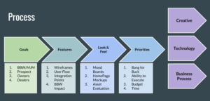
Welcome to “sticky” world. We sat down with the two founders and had them write sticky notes for everything they want their site to do, who would use it, and the challenges in their business. It quickly became clear that they wanted a site that extended their brand promise of “my friends who custom build high end luxury items” and brought the very tangible experience of building these items online for their prospects, owners, dealers and the community. We then transferred the stickies to a Trello board (great tool if you haven’t used it) and organized them into goals and features for each of their audiences – and then prioritized them.
Step Two: What Features?
Using a great wireframing tool called Moqups, we created rough interactive sketches that showed the layout and features on each page. This tool is great because it lets you quickly plan the functionality in the system without fussing about design elements like colors and fonts. We made a lot of changes at this stage as our clients began to understand how the pages would link together and how users would interact with them – and they were able to give us valuable feedback.
Step Three: What Look-and-Feel?
Once the structure of the pages were finalized in our wireframes, we started designing how the pages would actually look – in terms of their fonts, colors, button styles, and other visual elements. Our first versions were way off, but after a few iterations, we are on track with a look-and-feel that our clients are happy with.
Step Four: Now we can Focus on the “How”
At this point we took a step back and figured out how big this project is and what a “Minimally Viable Product” would look like, and what would fit in their budget and timeframe. We often try to map out an MVP that can be developed in a few months. We then add or change features over the course of the coming months as we learn more by watching usage and interviewing actual users.
Having done this for many clients, we know that a project that kicks off with a solid Who, Why, What and How will be much more successful – and in the end a lot less expensive than that project where we just jump into the How. It is also worth noting that the time for the first steps can be very quick (1-2 weeks) and will not generally hold up a project.

Here is how we think of the process. Notice that the creative, technology, and the business process are all equally important in the final deliverable. All too often, projects miss the business process changes and a project sits on the shelf while they figure out if anyone will be able to maintain it.
